ARM Event 2026
For the April 2026 ARM Event, I worked with the VP of Meta Infrastructure and his team to shape the story and visual direction, turning a set of complex infrastructure initiatives into one clear experience for key industry audiences.
15+ years leading creative across brand, digital, campaigns and presentations, most recently at Meta Infrastructure.
Explore my work by discipline
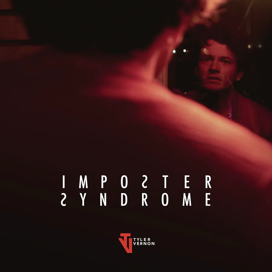 Artist Identity & DirectionOngoingCreative direction, album covers and photography for an emerging music artist.
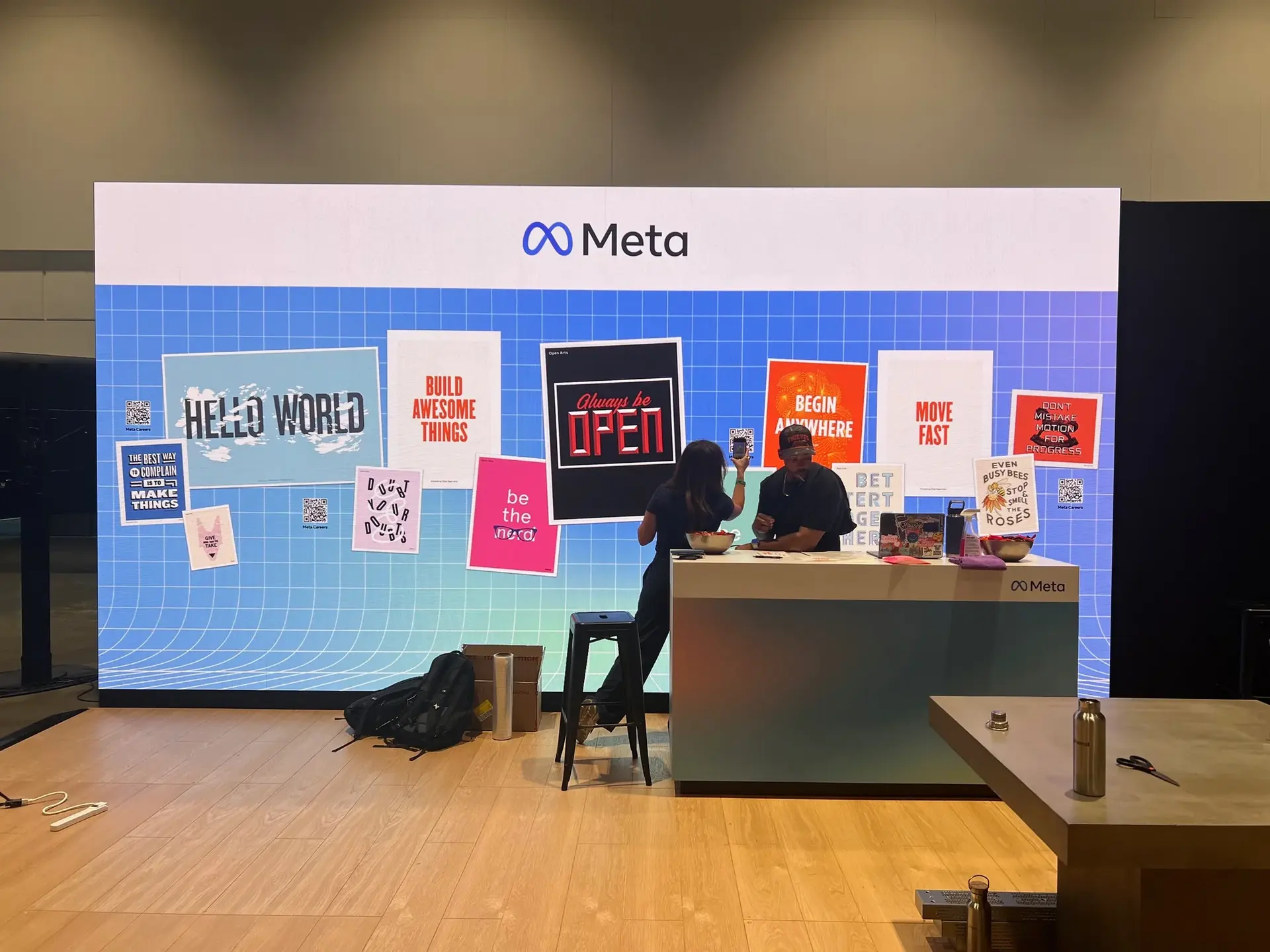 Meta Infra2019 – 2026Led creative for audiences of up to 10,000: keynotes, event design and visual systems for ARM Event, OCP Global Summit, AI Infra Summit and Network Infra Summit.
 Inizio Evoke2021Art direction and the visual system behind public, patient and provider websites.
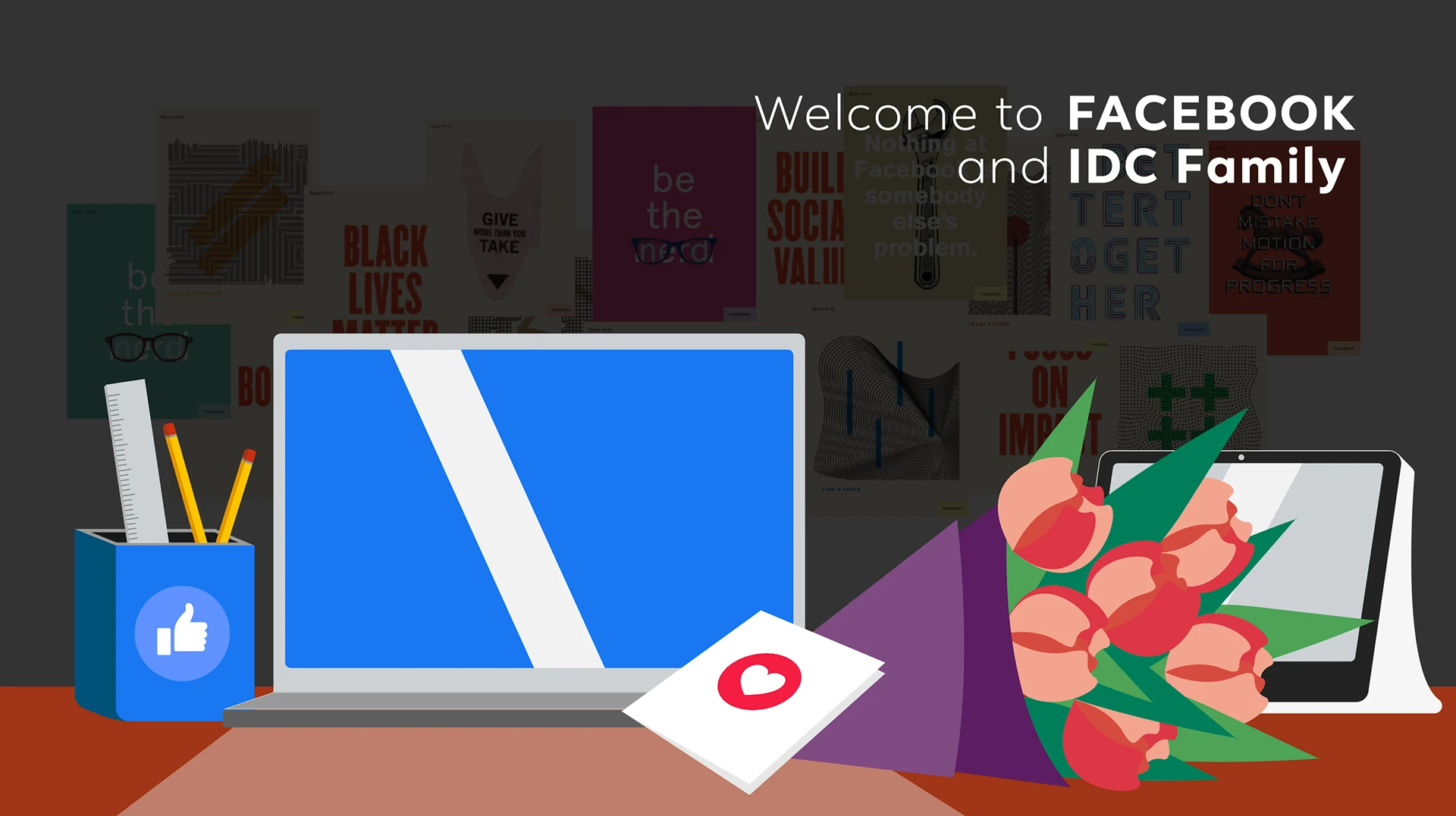 Meta Infra Data Center2019 – 2021Program branding, slide systems, event posters, characters and logos.
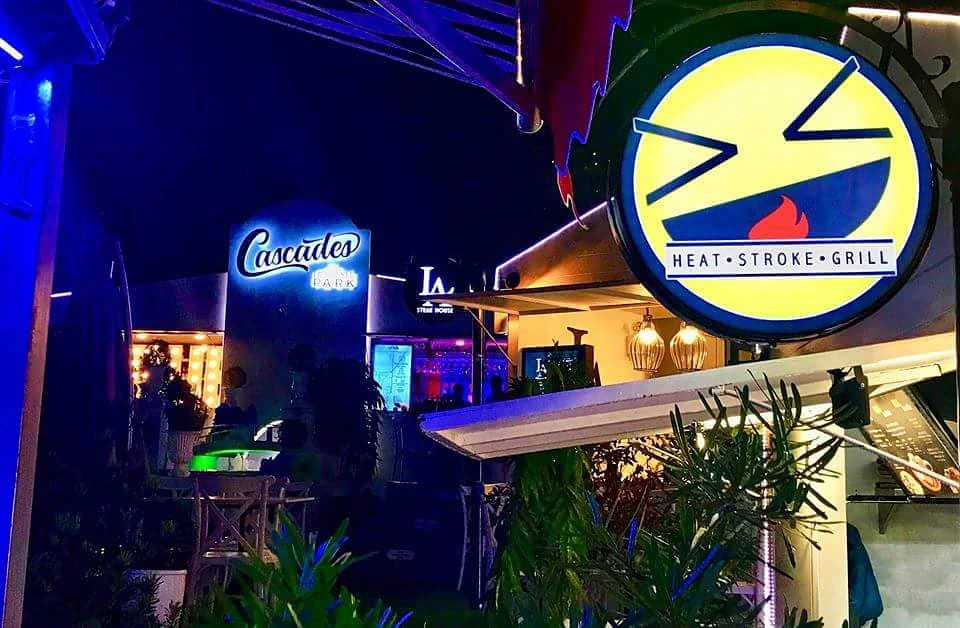 Heat Stroke Grill2016 – 2019Acquired by Fruitas Inc. in 2019: a Metro Manila barbecue pop-up and its brand, built into three branches.
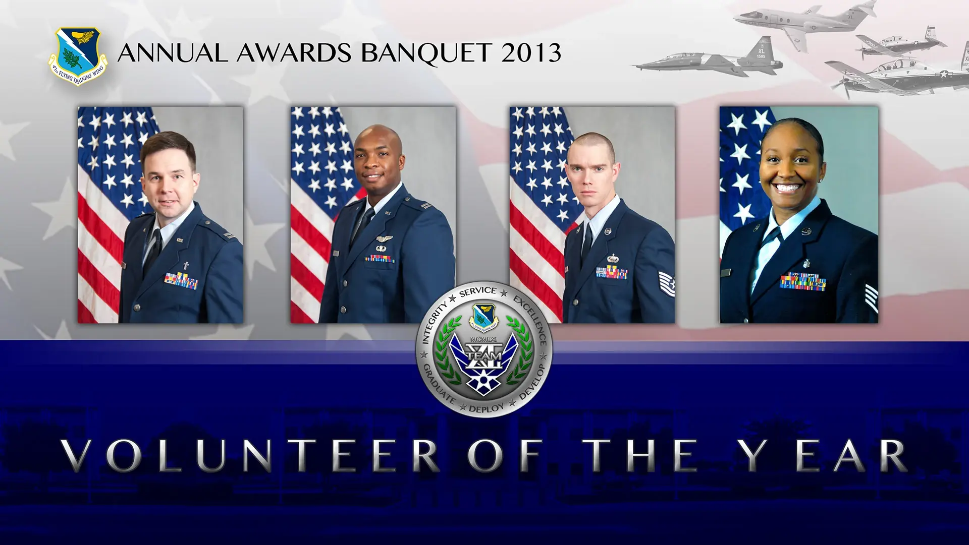 US Air Force2012 – 2016A flyer I designed helped the base secure millions in funding. Also awards banquets, challenge coins and posters.
 Presentation designsKeynote decksKeynote decks of 300+ slides for audiences of up to 10,000, and the presentation systems behind them.
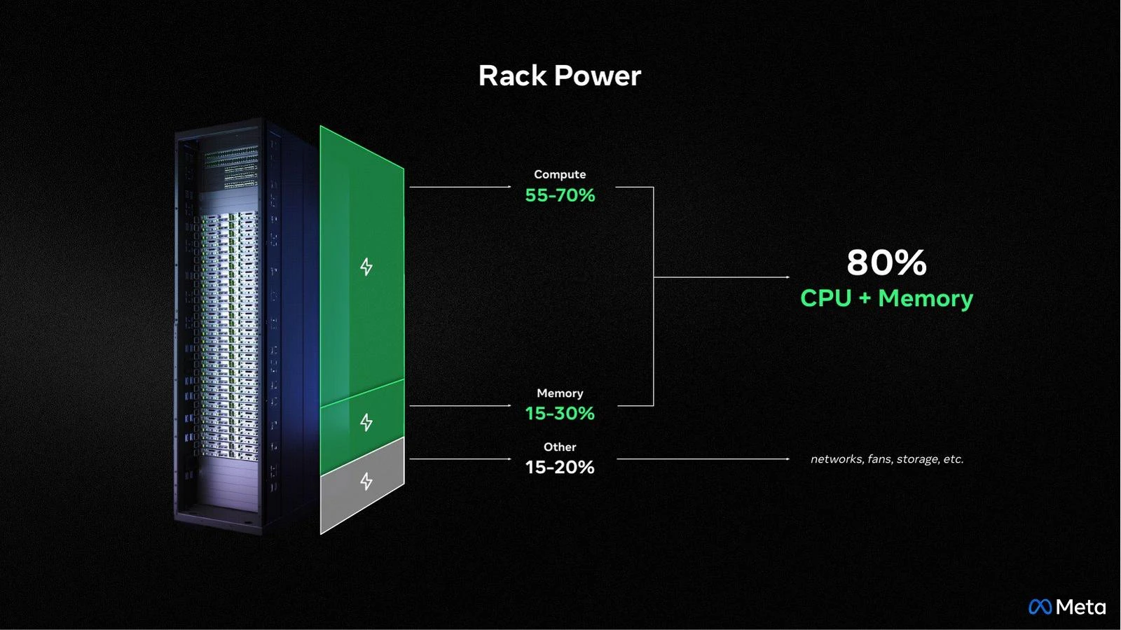
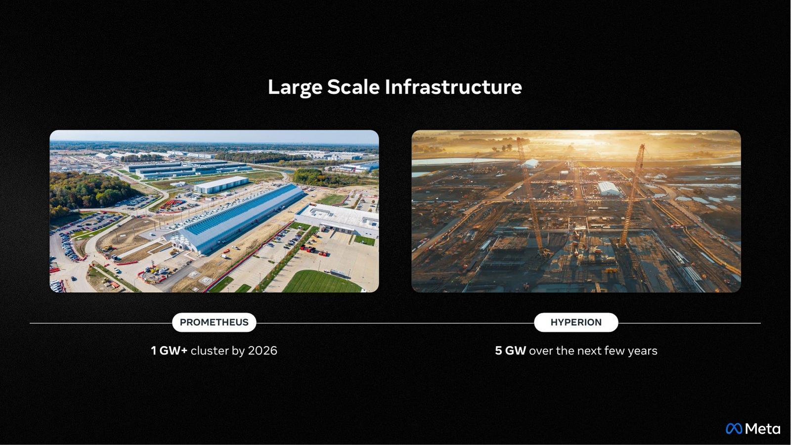 OCP EMEA Keynote2026Keynote slides for the OCP EMEA 2026 presentation, from large-scale infrastructure to rack power.
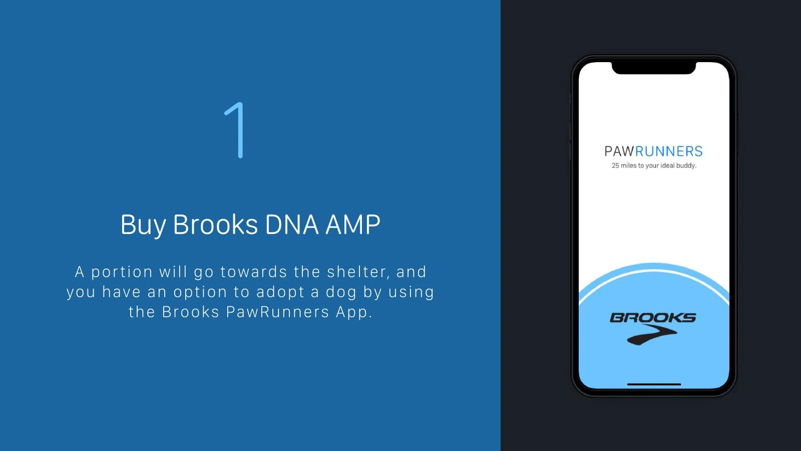 Brooks PawRunnersConcept campaignA concept app where running 25 miles helps a shelter dog get adopted.
 Logos, icons & badgesMarksMarks and emblems from across my work.
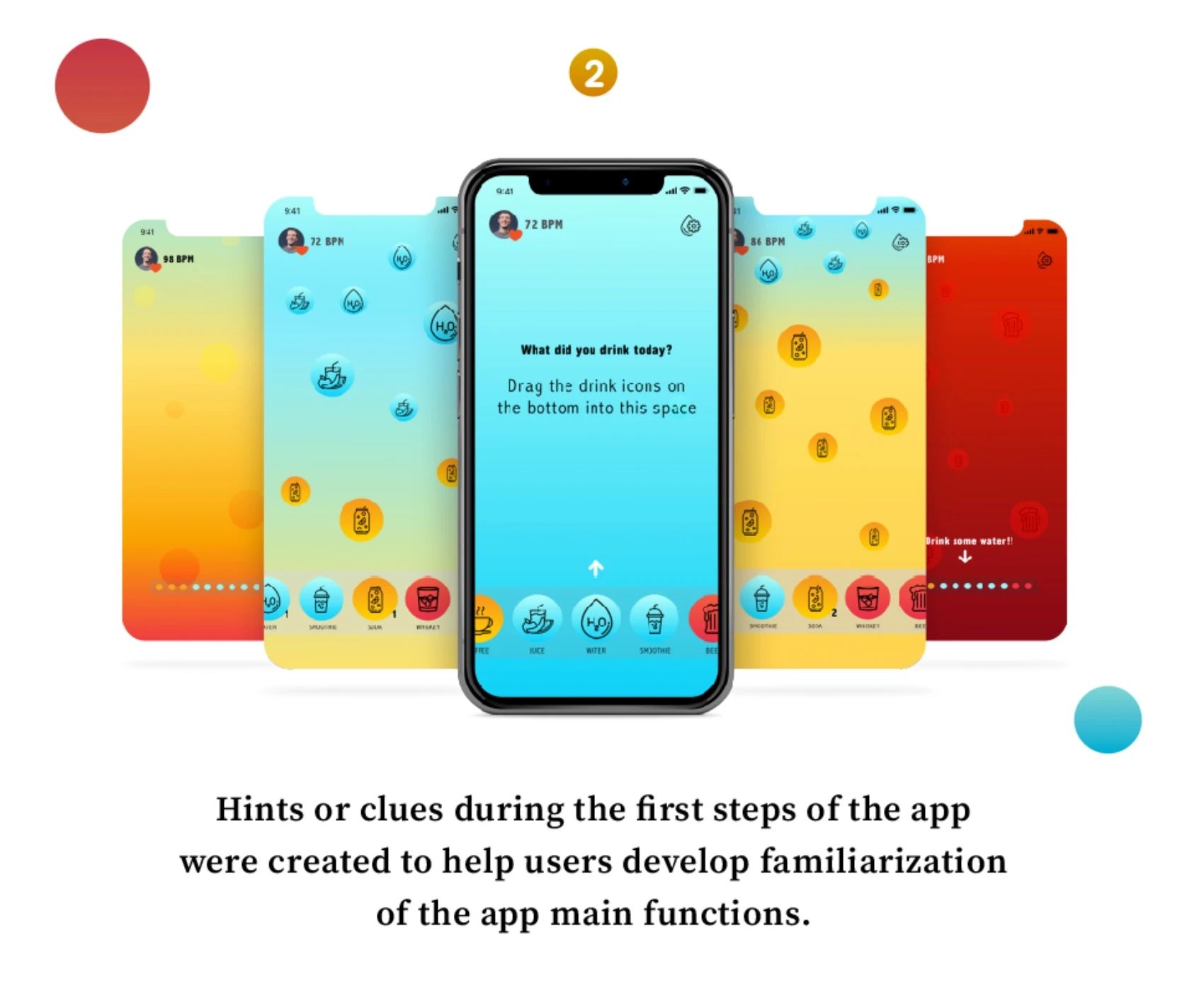 SH WaterUX case studyA hydration app that makes healthy habits visible, simple and motivating.
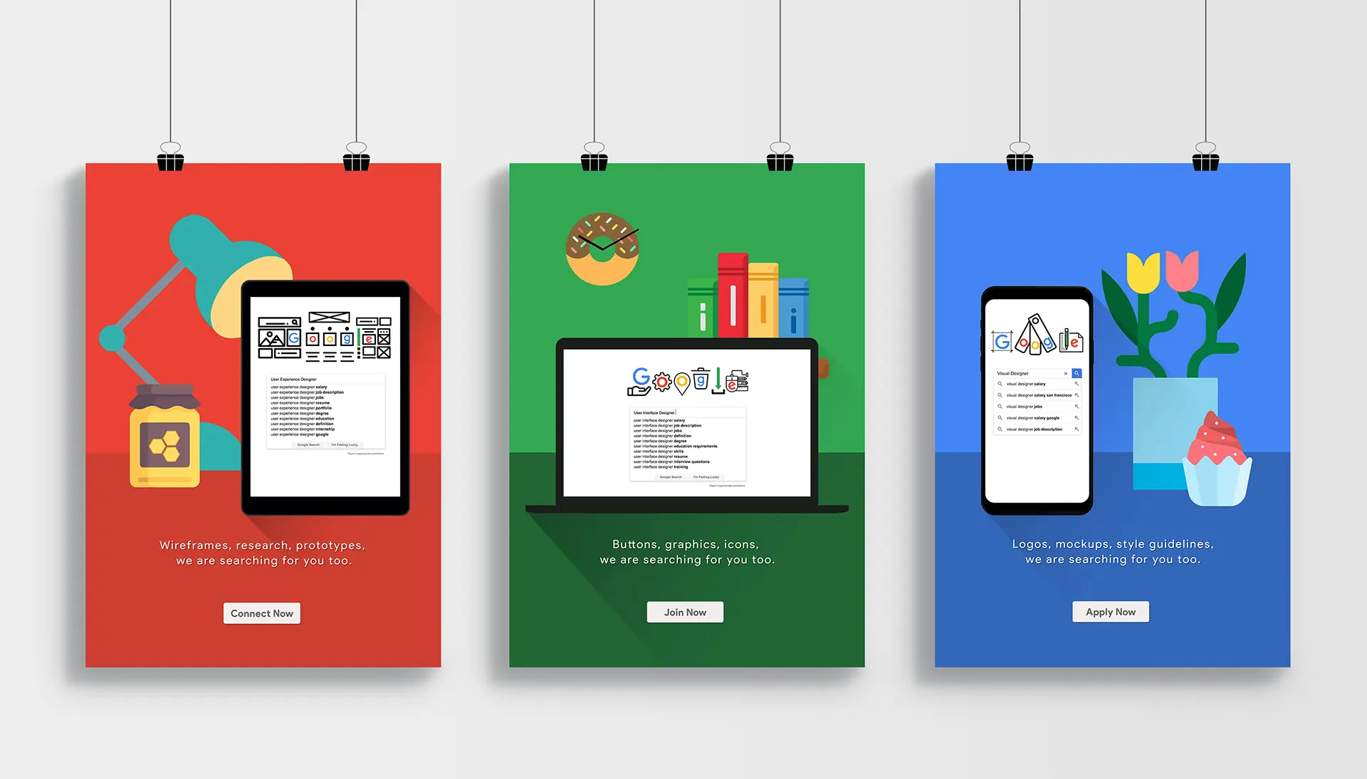 Google Ad CampaignConcept campaignA poster series that interprets Google’s brand in three ways.
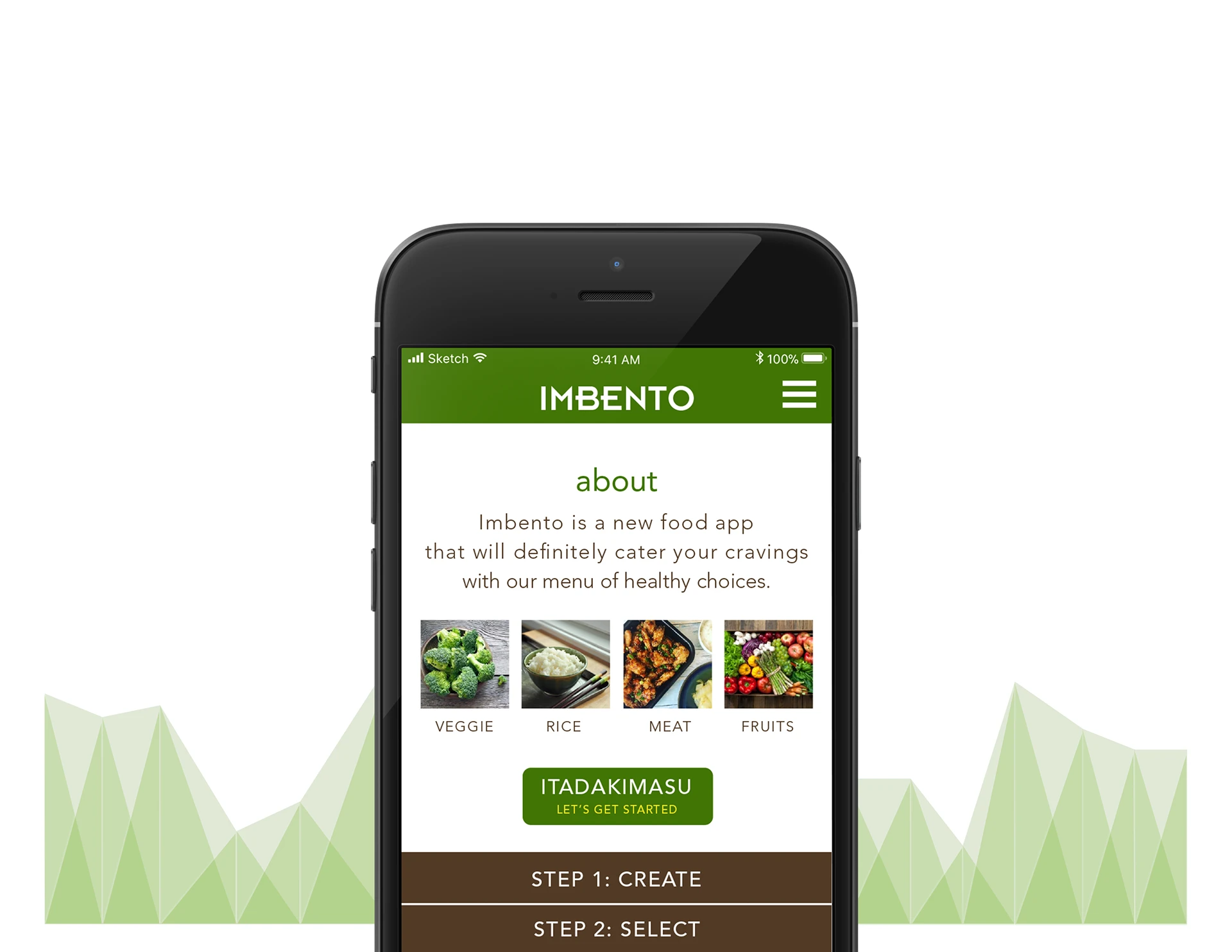 ImbentoUX design conceptA bento-box ordering app whose portions adjust with a drag.
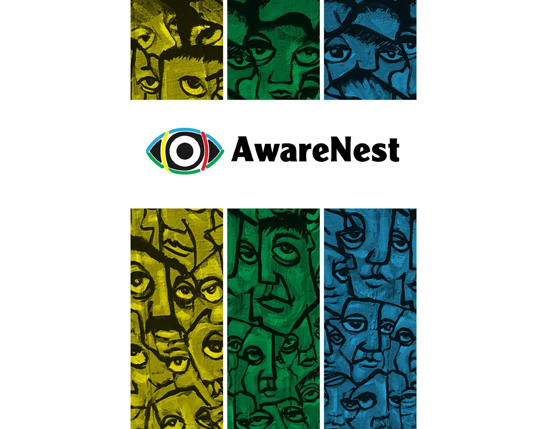 AwarenestConcept campaignAn awareness campaign about how media affects children at home.
Full details in the résumé.
Meta, full-time. Multidisciplinary creative across Meta Infrastructure
Meta, contract. The start of 6+ years at Meta
Inizio Evoke, San Francisco. Healthcare brand and digital work.
Y&H Creative
Heat Stroke Grill. Built the brand from the ground up
US Air Force
15+ years across brand, digital, campaigns and presentations, most of all in tech.
Each project opens its full story.
Keynotes, event design and visual systems. Led creative with VPs, engineers and Communications for ARM Event, OCP Global Summit, AI Infra Summit and Network Infra Summit.
View projectArt direction and the visual system behind public, patient and provider websites.
View projectProgram branding, slide systems, event posters, characters and logos.
View projectAcquired by Fruitas Inc. in 2019. As business partner and creative lead, I helped grow a Metro Manila barbecue pop-up and its brand into three branches.
View projectVolunteer creative designer at Laughlin AFB. A flyer I designed helped the base secure millions in funding and earned me Base Airman of the Year, alongside awards banquets, challenge coins and posters.
View projectDecks, marks and case studies, each with its own page.
Full details in the résumé.
Meta, full-time. Concept to delivery on keynotes, logos and visual systems across Meta Infrastructure, with VP and director sign-off.
Meta, contract. The start of 6+ years at Meta
Inizio Evoke, San Francisco. Healthcare brand and digital work.
Y&H Creative
Heat Stroke Grill. Built the brand from the ground up, through its acquisition by Fruitas Inc. in 2019.
US Air Force
From people I have worked with.
“Mark is a thoughtful and valuable team member, and a great partner. I had the great pleasure of working with him on a wide variety of projects, and saw his tremendous talent firsthand. Whether creating logos for Meta teams, projects, and products, or designing graphics for a post, wiki, or web page, or even producing and editing audio for a podcast, Mark always comes through brilliantly when it comes to creative and technical execution. He will surely elevate any team and I hope to continue to work with him.”
“Huge thanks for your support for Meta keynote design work and jumping in at the last minute to support all critical changes required! Your ability to deliver under pressure was a lifesaver, and your creative touch made all the difference.”
“Thanks a bunch, Mark, for your very creative ideas and providing clean designs for various needs from TPM. This is super helpful for quick messaging of complex initiatives. Much appreciated!”
“Thank you for your creative skills and slide mastery that enabled bringing the RL and Infra Silicon teams together for the first time in 4 years! This built community for our silicon teams at Meta, and helped bridge the gap across projects, tooling, and investments to make us better at the company level.”
“Mark is an incredibly talented designer. His work was consistently phenomenal, visually polished, thoughtful, intentional, and always grounded in what the project needed. He has a natural ability to see the bigger picture, take an idea, and turn it into something beautifully designed and exceptionally well executed. Any team would be lucky to have his talent, creativity, and collaborative spirit.”
“Thank you for your excellent work on preparing all the communication related to this. We were able to get it done in a short period of time and with high quality, which is a significant achievement. Given many questions in the media about MTIA, the impact of this proactive communication will be big, as we no longer just play a defensive role in the face of leaked information. I appreciate your rigor, attention to details, and fast response in this effort.”
“Thanks, Mark, for upleveling the VP of Network Infra’s slides. I enjoyed working with you! You were super fast, and I think the final product hit the expectation!”
“Thanks, Mark, for helping Eng and infra better visualize the growth of our subsea network. The compelling imagery and infographic you created for APAC will now serve as our template and the educational framework for helping tech elites and policy makers better understand the importance of Meta’s digital infrastructure.”
“Thank you, Mark, for all your help and support in designing the visual elements of DABI 2024. Your creative expertise was instrumental in crafting the slide templates, posters, agenda, videographics, and overall aesthetic of the summit. Your high-quality and elegant designs truly elevated the event! Thank you again for your contributions to DABI 2024.”
“You are the man! Thanks as always for going above and beyond. Your help to get the new SiteOps EMEA logo was an important detail for the success of the implementation of the new area!”
At Meta, I served as a creative lead and visual designer for the infrastructure organization, partnering with VPs and Directors to turn complex technologies into compelling visual stories. I led creative direction across executive communications, event branding, team identities, design systems, engineering blogs, and product videos, creating cohesive experiences across channels and reaching audiences of up to 10,000 employees.
For the April 2026 ARM Event, I worked with the VP of Meta Infrastructure and his team to shape the story and visual direction, turning a set of complex infrastructure initiatives into one clear experience for key industry audiences.
Executive blog features need technical depth that anyone can follow. I led creative with the Senior Director of Engineering, partnering with UX designers and the production team to turn complex technical insights into clear digital assets. Read the related Meta AI article: MTIA: scaling AI chips for billions ↗
For the OCP EMEA Summit, I worked with engineering leadership on keynote visuals that make intricate software and infrastructure ideas easy to follow.
The VP of Infrastructure Foundation needed to explain Meta’s critical infrastructure initiatives to a broad audience. I worked with the comms team to build the visual strategy and presentation structure that made it possible. Read the related Meta Engineering article: Meta’s infrastructure evolution and the advent of AI ↗
I partnered with the VP of Hardware & AI Systems Infrastructure to develop their executive keynote narrative. As Creative Design Lead, I also shaped Meta’s presence at the San Jose Convention Center into one cohesive visual brand experience.
At OCP, the keynote and the booth had to tell one Meta story. The slides run dark and the booth is mostly hardware, so I looked to what people already know us for: Facebook and Instagram. I built the booth around those product brands, within Meta’s guidelines, so visitors recognize us at a glance. Many stopped to tell us they liked it, and it stood apart from the hardware-led booths around it.
I partnered with the Senior Director of Data Center & AI Networking on their executive presentation, and led the visual strategy for Meta’s exhibition booth at the San Jose Convention Center. Read the related Meta Engineering article: Meta’s Open AI hardware vision ↗
During keynote rehearsal, the narrative had to change. I had two hours to rework it and update every slide to match.
I led creative for the internal Network Infrastructure Summit, building the visual story with the VP of Network Infrastructure and seven subject-matter experts. The goal was to turn complex technical roadmaps into one consistent presentation system.
Every two years, more than 1,000 people from around the world gather in Menlo Park for the Network Infra Summit, one of the largest internal events in Infra. Ten leaders, each with a different topic and at least 50 slides, had to feel like one story. I presented three concepts in the first week, then carried the chosen direction through everything attendees see and touch.
Meta’s official subsea infrastructure blog post was full of dense technical data. I led creative with the Senior Director of Engineering to turn it into visuals anyone can read, then prototyped and edited the 30-second motion teaser using custom Keynote animations. Read the related Meta Engineering article: Introducing the Candle subsea cable ↗
The Infra Foundation org needed one clear home for its teams, new-hire onboarding and career resources. I designed the wiki’s visual layout and identity to be exactly that.
As Art Director at Inizio Evoke, a healthcare agency in San Francisco, my main project was VYEPTI, Lundbeck’s preventive migraine treatment. I art-directed and designed websites for the public, patients and healthcare providers. Most agency work is confidential, so this is the public-facing work, still live at vyepti.com.
Art direction and visual design for the patient experience: the overall style, the geometric backgrounds behind the photography, the rounded card system, and the patient-story carousel.
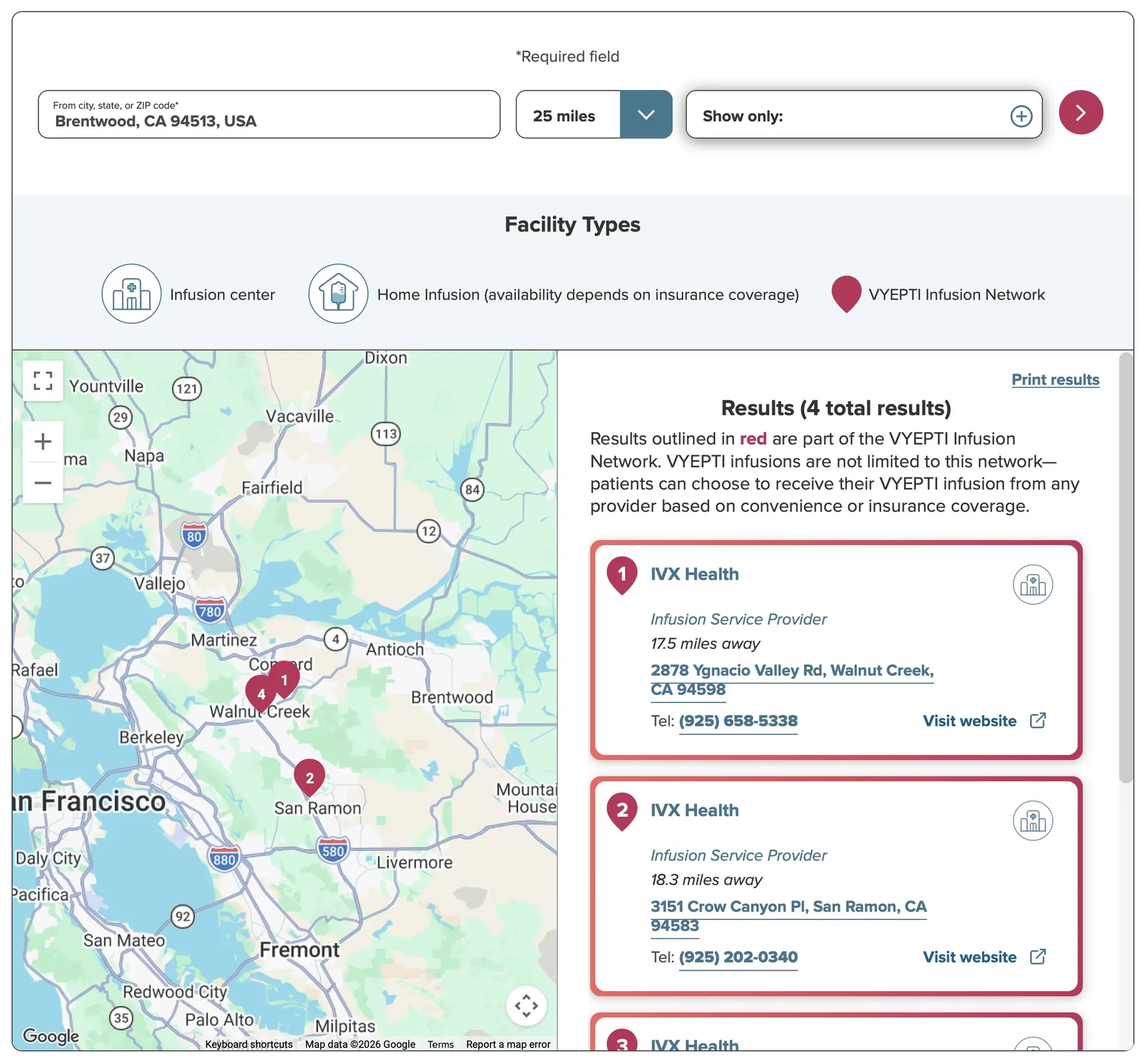
A find-a-provider tool for infusion care: search, a legend of facility types, map pins, and result cards that mirror the map. Still live today.
One consistent line style across the whole experience — support, locator, and treatment-journey icons drawn as a single system.
The stat tab was an original component, built to showcase the three product differentiators. The savings card carried the same system into print — the card patients actually hold.
The same system, tuned for healthcare providers: direct and practical, with the locator at the center.
As Creative Designer for Meta’s Infrastructure Data Center team, I led the visual design for IDC TeamEx: program branding, executive communications, large-scale events and digital storytelling.
TeamEx programs and executive communications needed decks that stayed clear and consistent across many teams, so I designed them to work as one family.
TeamEx programs and events were announced by email and on internal pages. I designed the banners and web graphics that carried each announcement.
Each TeamEx program needed a home that was easy to scan. I designed internal wiki pages that gave each one a clear, branded place.
Every TeamEx event poster is built on its program’s branding, so each one is instantly recognizable.
I created a cast of characters to give IDC programs, events and internal storytelling a consistent, recognizable face.
I designed icon sets and logos so each TeamEx program and community had its own recognizable mark, including the Book Club identity.
Smaller graphic pieces made alongside the larger programs.
I served on active duty in the US Air Force from 2012 to 2016 as an Engineering Technician at Laughlin Air Force Base. Design was my passion, so I volunteered as the base’s graphic designer, on everything from classified programs to local military events. For four years I was lead designer for the Annual Awards Banquet and the Air Force Ball, creating logos, military coins, posters, tickets and AV presentations.
My proudest project. I worked with base leadership and pitched ideas for how to make the case, then designed the flyer that was presented to senior USAF officials and local government leaders. It helped the base secure millions of dollars in funding and earned me Base Airman of the Year at Laughlin AFB. (Some copy and details omitted due to classified information.)
The 2013 banquet came together as three pieces, left to right: the admission ticket, the AV presentation slides, and the main promotional poster, which hung on bulletin boards across the base.
Below is the actual medal I designed for the event and used on the poster. This one is mine, received for winning Base Airman of the Year.
The ticket used a different color for each of the two participant types, so the event coordinator could tell them apart at a glance.
One of my favorite projects was the Mission Support Group Commander’s challenge coin — a limited edition awarded only to the “best of the best” in the mission support organization. I’m humbled to have received the very first one, handed to me by the Commander.
Another concept: a coin for participants in the annual Adventure Race in Del Rio, Texas, that doubles as a bottle opener. The Civil Engineer Squadron and AF Sergeants coins are below.
More design work from my years at Laughlin AFB, beyond the major events above.
Heat Stroke Grill began as a pop-up barbecue restaurant in Metro Manila. From 2016 to 2019 I was its business partner and creative lead, building the business and the brand together. Barbecue is a beloved comfort food in the Philippines, so we gave the brand an authentic, welcoming voice and grew through social media and mobile food app partnerships. In 2019, Fruitas Inc., a major Philippine food service company, acquired Heat Stroke Grill.
The pop-up grew into three locations across Metro Manila.
The identity is simple on purpose: authentic and comforting. I designed the logo to welcome customers warmly and bring an instant smile. In marketing, playful hashtags on social media and little pins to share with our community kept that warmth going.
Presentations built end to end. The information-design pieces turn dense technical material into clear infographics; the campaign decks cover research, strategy, concept, and design. I led each project from start to finish, setting direction and refining the work with cross-functional teams.
Infographics and visual overviews that turn dense, technical material into something clear at a glance.
Keynote design for Meta at the OCP EMEA Summit in Barcelona — “Data Center Compute Evolution,” presented by Paul Saab. A deeply technical talk — gigawatt-scale infrastructure, rack power, Arm and memory — carried as one clear visual story.
Presentations designed on commission.
The causes of medical errors as a visual overview — statistics, frameworks and data charts in a single burgundy-and-MRI system.
An ethical dilemma in nursing — the case for and against physically restraining patients, and how to minimize the conflict.
The talks I designed for, as presented by Meta at external industry events.
Executive keynote for the VP of Hardware & AI Systems Infrastructure at the OCP Global Summit 2025. I developed the keynote narrative in partnership with him.
Executive presentation for the Senior Director of Data Center & AI Networking at the OCP Global Summit 2024, built in partnership with him.
Concept, strategy and design — for each of these five, I created the idea and built the deck end to end.
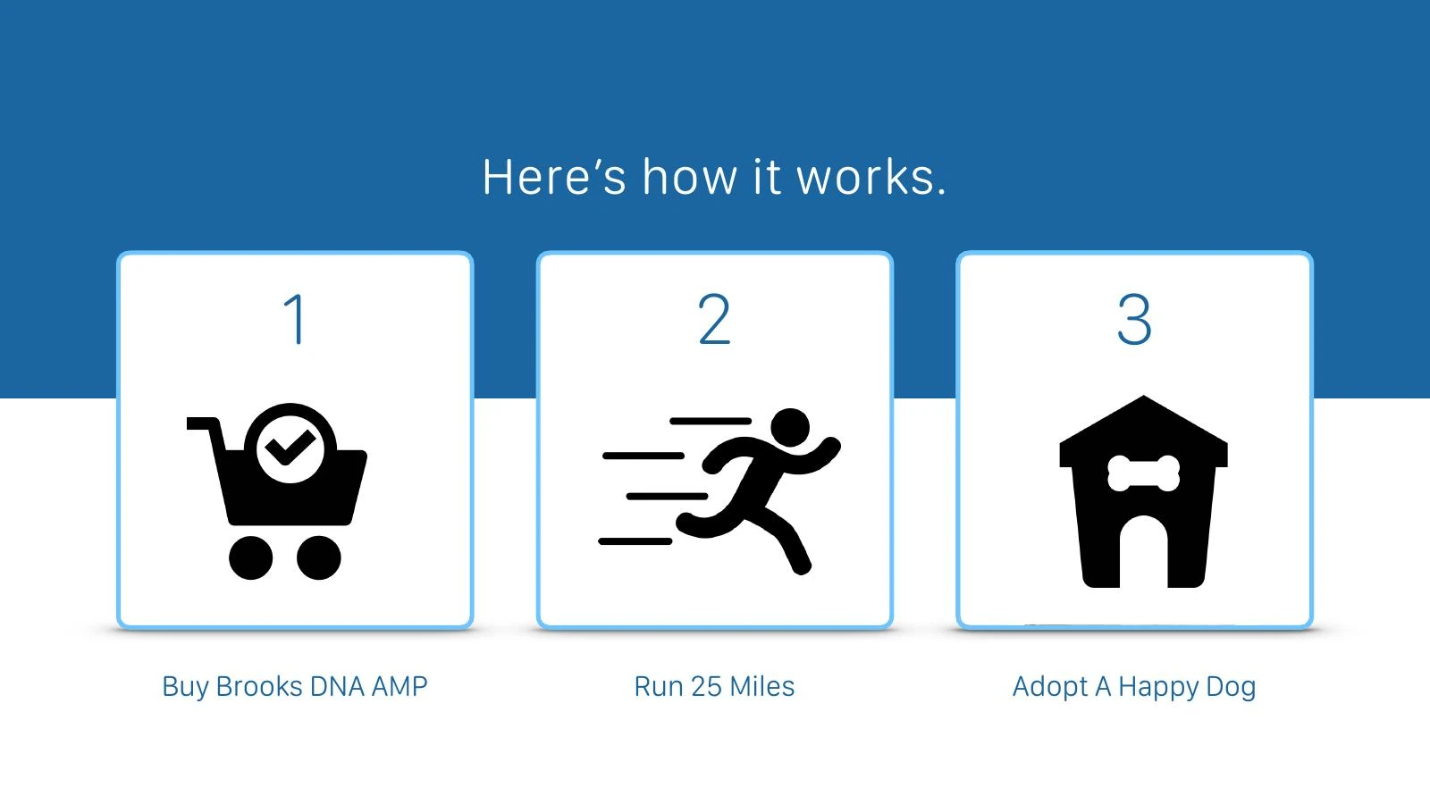
Campaign concept, strategy and design. Buy the shoes, run 25 miles, adopt a shelter dog — an idea with a heart, carried through an app, print and film. Art Director entry for The One Club for Creativity and Ad Age.
The ‘More Than Digital’ campaign, end to end — research, competitors, personas and creative brief through to print, social and experiential. ‘When seeing is believing.’
A Design School project — four campaign concepts for Spotify in one high-energy deck: a crowdsourced festival, VR concert memories, cause marketing and the Monday Blues cure.
The ‘Better Everywhere’ campaign — print, social, out-of-home and video concepts in one bright, disciplined system.
Self-initiated concept — not commissioned work. Presented for mentorship. A keynote-style deck in Apple’s presentation language — restraint, photography and type doing the talking.
Logos, icons, and emblems from across my work: program identities at Meta, a barbecue brand in Manila, and challenge coins for the US Air Force.
Emblem-style badge marks, each designed to stand alone as insignia.
Iconography and logos that gave IDC TeamEx programs and communities their own identities.
Identity work that gave the Infra Foundation org and its programs a recognizable look.
A warm, welcoming mark for a comfort-food brand — designed to bring an instant smile.
Coin and emblem designs from my time at Laughlin AFB, including the Civil Engineer Squadron coin and the AF Sergeants coin.
Five case studies across UX, campaigns, and creative direction. Each shows the challenge, the approach, and the result, so you can follow the thinking.
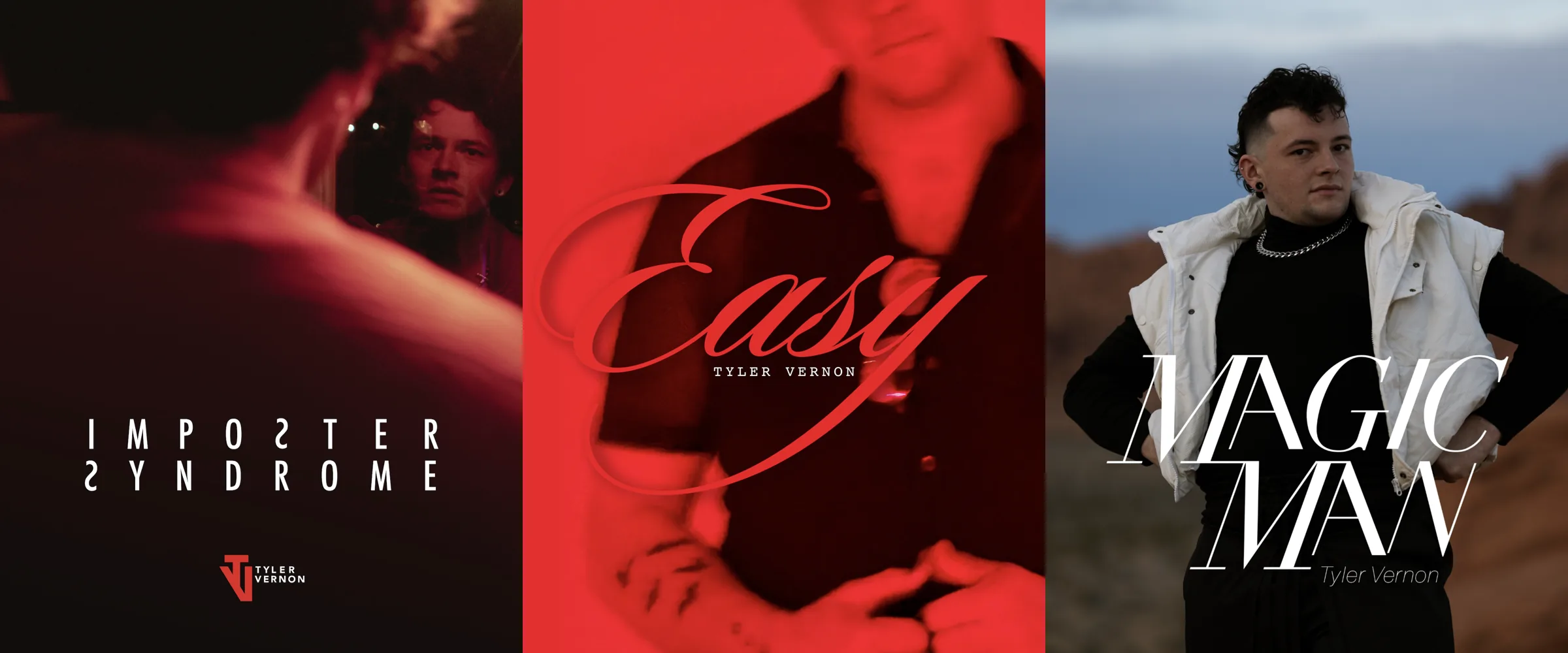
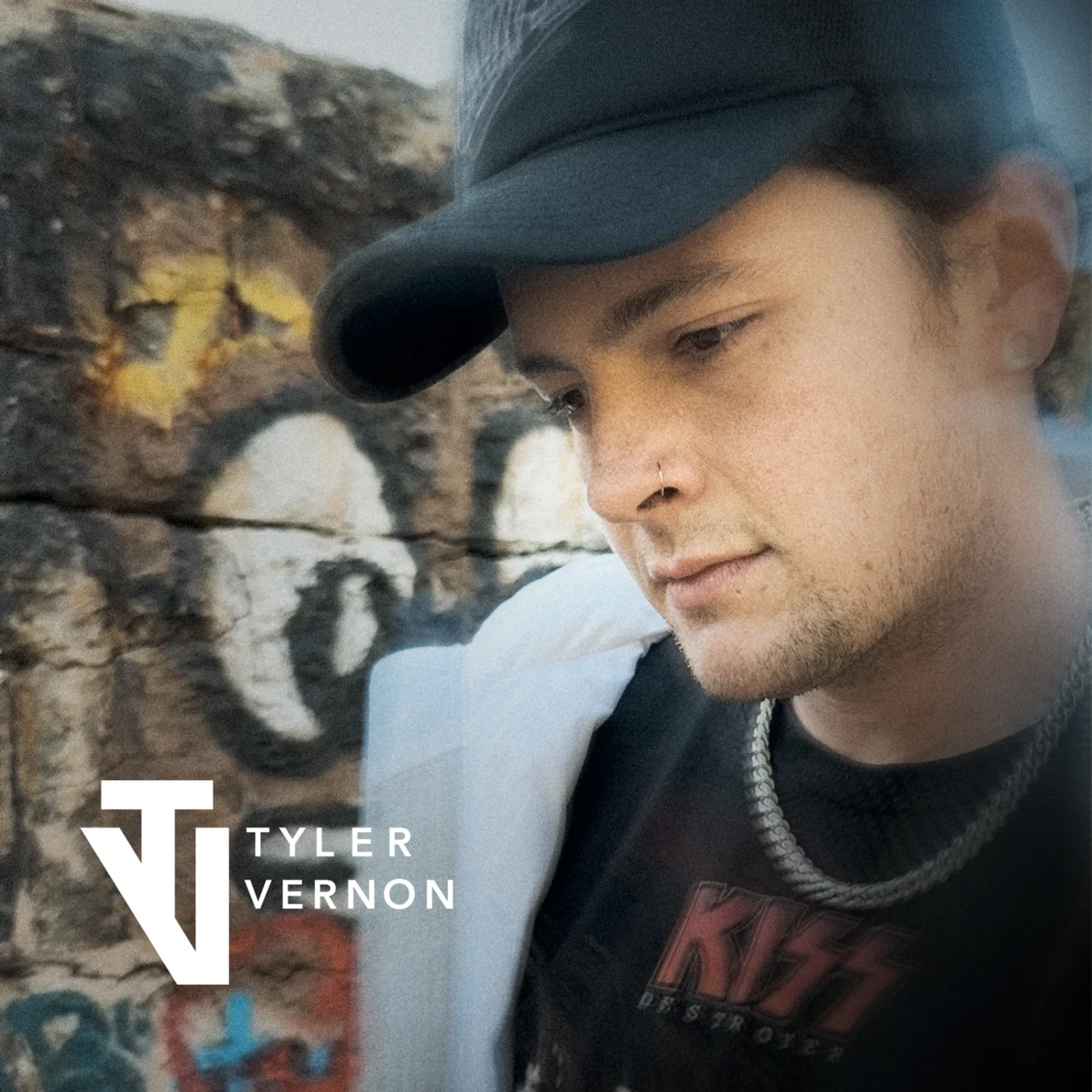
Creative direction, album covers and photography for an emerging music artist.
Open case study →
A hydration app that makes healthy habits visible, simple, and motivating.
Open case study →
A poster series that interprets Google’s brand in three ways.
Open case study →
A bento-box ordering app whose portions adjust with a drag.
Open case study →
An awareness campaign about how media affects children at home.
Open case study →A mobile experience that makes hydration visible, simple, and motivating — without turning everyday health into homework.
Role — UX/UI designer: I framed the problem, synthesized the research, and designed the interaction and visual system end to end.
Skills: Research · Branding · Visual Design · User-Centered Experience and Design
Stay Hydrated is a drinking water mobile app. The company’s mission: use software to get people to drink more water and eat healthier. My job was to turn that mission into an app people would actually keep using.
Most food-related decisions aren’t the healthiest, and people everywhere could be better educated on the long-term damage of not drinking enough water. Most people don’t drink enough water per day, and most could make healthier food-related decisions.
Business goals
User goals
Learning goals
Being healthy takes time, money, and sacrifice, so research started with who the users are and what gets in their way. I mapped the user, the problem, and the solution, then tested three assumptions against seven personas, from an engineer to a full-time student.
All personas drink water and eat healthy meals every day.
Almost all drink water daily; some forget because of work. Almost all want to eat healthy, but availability and budget decide. Most prefer organic and skip it because of price, unless it’s on sale.
PartlyAll personas prefer bottled water to tap.
Only one prefers bottled, because of a health condition. Most prefer filtered water, most drink tap, and almost all won’t buy expensive bottled water. Almost all drink water first thing in the morning and at least 20 minutes before bed.
Didn’t holdAll personas are more health conscious and know what is healthy.
All know the importance of drinking water and eating healthy, believe water keeps them awake and energized at work, and believe exercise matters. Most have used an app that tracks water and food.
HeldIn their words
“…I have an app before that tracks my food and water but I stopped using it because it was complicated to use, you have to click a lot of button…” — Engineer, 25
“…I have never used an app for that, but I have a water tumbler that I use as my reference of how much water I have taken in a day…” — Call center agent, 30
The less interaction the user has, the more chance they will use the app.
New mission
Build an app that is user friendly and easy to use, with a cool interface that motivates users to drink more water.
Paper wireframes for the Profile, Homepage, and Customize screens went in front of users, who answered on sticky notes. Their feedback shaped the prototype before any visual design began.
Drag a drink, don’t fill a form. “What did you drink today?” — drag the drink icons from the bottom into the open space. Logging a drink is one gesture, because fewer interactions mean more use.
A screen that reacts to you. The home screen shifts from blue to yellow to red alongside the heart-rate reading, with a prompt to “Drink some water!!” when it runs red. A smart watch or Health Kit can be connected.
Progress you can see. The profile shows a status — excellent, enough, or not good — plus points collected by drink, daily to yearly views, and a QR reward to redeem.
A first run that asks little. Sign in with email, Facebook, or Google, connect a watch or Health Kit, and pick the drinks you always have besides water.
Overall, the user testing was successful, and many suggestions went into improving usability. Testers liked that it was “simple and clean,” “easy to use,” and that the icons worked well. The confusion — “I’m not sure what to do,” “what’s the empty middle screen” — came from one place: the prototype’s lack of animation. Users eventually solved it and understood the nature of the app.
Next
Prototype the motion the testers needed to see.
A bento-box ordering app that makes the meal yours — its signature interaction lets you adjust the portions of your food by dragging.
Role — UX designer: the concept end to end — personas and journey boards, the step flow, wireframes, and the interface design.
Bento ordering is fixed-portion and rigid: the box arrives as a set menu — set items, set amounts — and the apps that sell it inherit that rigidity. There is no room to make the meal your own.
Portions you drag, not pick. The signature interaction replaces size menus with a direct gesture: drag the serving line, and the portions change with it. Portion control becomes something you do with your hands, not something you request.
A five-step guided flow. Ordering runs as a step guide — Create, Select, Modify, Deliver, Confirm — so a customizable order never turns into a complicated one; each step asks for one thing at a time.
A visual language rooted in Japan. The mood board grounds the design in Japanese culture, where the bento box began; its interiors, gardens, and bonsai set the tone the interface follows.
The final screen set pulls the system together: the landing page opens on the menu categories and the steps ahead, and the box that arrives is portioned by the person who will eat it. One direct interaction loosens a rigid format.
A poster series that translates Google’s core brand identity into print — iconic color and playful language, pushed through experimental layout and composition.
Role — Art Director, Copywriter & Strategist
Google’s identity is unmistakable, which makes it hard to extend: the series has to stay instantly recognizable while saying something new — experimental layouts that balance bold typography, photography, and the iconic identity, without breaking the brand.
Play with the logo’s letters. The first drafts establish a brand-consistent aesthetic, and the first version builds the posters from the wordmark with letters dropped. The feedback likes the background colors but asks the right question: with letters missing, does it still communicate? The layout goes back to work.
Rebuild on a modular grid. The second version answers with structure: a modular grid system creates a more dynamic hierarchy across typography, photography, and identity. It also plays the logo as it appears on Google’s search page — a search engine that already knows what you’re looking for.
Push the playfulness, and add the ask. The next feedback round asks for a call to action and even more play. The final direction sets the series among everyday objects from home and workspace, and weaves in Android’s dessert names — Cupcake, Donut, and Honeycomb.
The final feedback lands where the series aims: the posters’ playful tone captures the company’s identity — and each poster now closes with its call to action.
An awareness campaign about the effects of television shows, video games, and music on children — and the lack of adult supervision, especially at home.
Role — Visual design: identity, poster series, and microsite.
The effects of television, video games, and music on children are easy to dismiss as harmless — adults often neglect them entirely. And they land hardest where supervision is thinnest: at home.
Speak to the parents, not the children. Every message addresses the adult: the posters ask “Aware?” and the campaign asks whether we are all responsible enough. Awareness is framed as the adult’s job.
Give the campaign a watching eye. The identity builds on a single eye mark set over a pattern of faces: the nest is the home, and the eye is the attention the campaign asks adults to pay.
Confront each medium directly. Television, video games, and music each get their own poster — no abstract danger, just the everyday inputs named one at a time, in the series below.
Three media, three posters, one question for the adults in the room. This project is dedicated to my nephews and nieces.
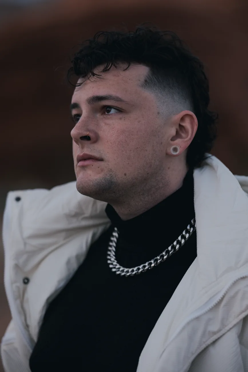
Giving a new voice its own look: the identity, the album covers, and the photography for an emerging music artist, built one release at a time.
Role — Creative Director, Album Cover Designer & Photographer
This started as a conversation between two creatives, not a client brief. He had the songs and a clear sense of who he wanted to be. My role was to translate that into a visual identity through photography, typography and album artwork, pushing each idea further while keeping him the author of his story.
Every collaborator has a creative mind worth protecting. That belief shapes how I direct.
Each release became a chance to explore something new while building a recognizable visual language. When he took a new stage name, the challenge wasn’t to start over. It was to carry forward what we’d built and give the next chapter its own voice.
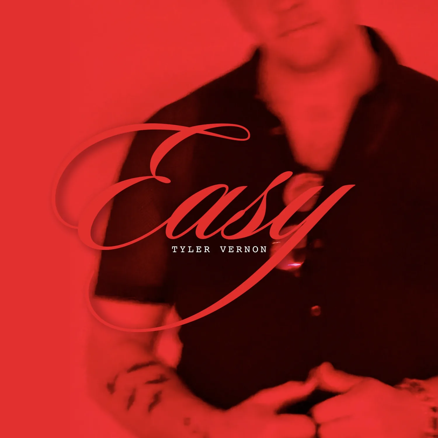
One monogram, everywhere. A bold TV monogram became his signature. It lands on the covers, the portraits, and the heart of the QR code.
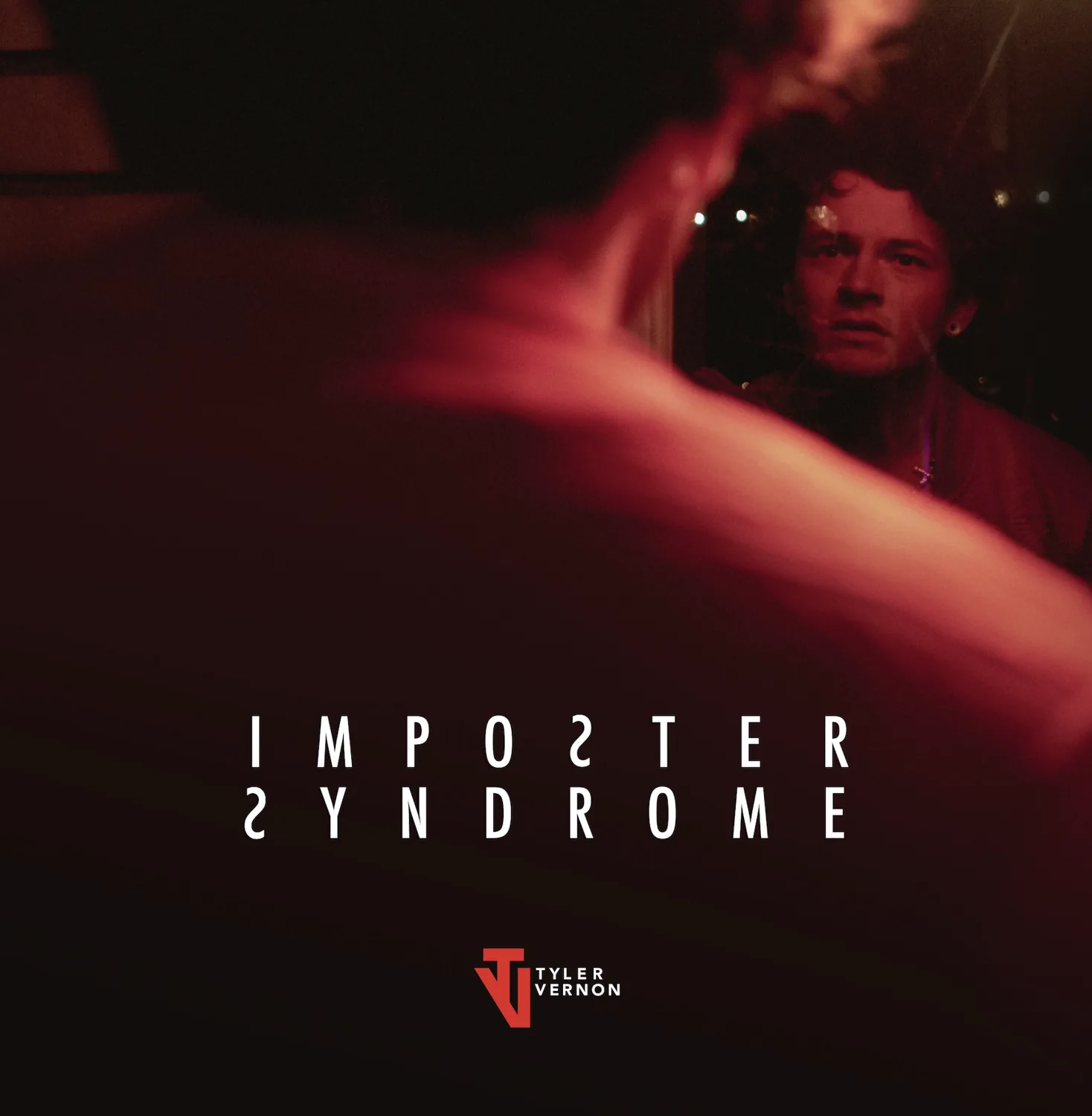
Three covers, one winner. For one record I developed three directions and we chose on concept, not an audience test. The mirror won: him confronting his own reflection, with the flipped S letters in the title echoing it.
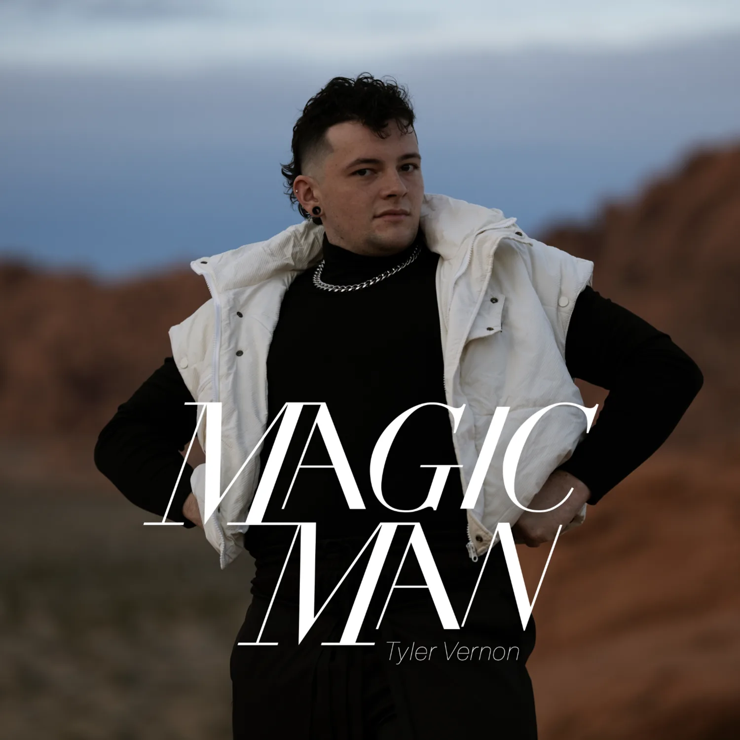
Every release gets its own world. For “Magic Man” the song felt hopeful and assertive, so we built a world to match: a lone figure on another planet. I directed and shot the sessions myself in Valley of Fire.
A business card that connects listeners directly to the music. The portrait goes on one side, the monogram and a QR code on the other.
When he changed his stage name to Vé Tristan, the brand had to move with him. The overall theme stayed bold red and black, but he wanted to try a different logo style: flashier and edgier than the original monogram. Engagement on Instagram kept pointing to the strongest work, so “Savior” leans into it: the same high-contrast photography, plus a brushed red title that cuts across the frame like a slash.
It is still unfolding. Every release adds to a system people can recognize, and the response to each one shapes the next. The follower growth reflects the whole release effort, not the design alone. What the design did was give the audience something instantly recognizable to respond to.
It is also where I am growing most as a leader: pushing ideas hard while guiding without taking over.

Multidisciplinary Designer with 15+ years of experience across technology, healthcare, brand identity, web and digital experiences, campaigns, presentations, events, motion, video, and visual communication.
Spent 6+ years at Meta turning complex technical ideas across AI infrastructure, hardware, networking, compute, and data centers into clear, engaging visual stories and scalable design systems. Previously worked in healthcare advertising at Inizio Evoke, developing digital and brand experiences for VYEPTI, Lundbeck’s preventive migraine treatment.
Hands-on from early concept and creative direction through design, iteration, stakeholder feedback, production, and final delivery. Known for bringing clarity to ambiguous problems, building visual systems that scale, and maintaining a high creative bar while managing multiple fast-moving projects.
Core skillsBrand & Visual Design Brand Identity, Creative Direction, Art Direction, Visual Systems, Typography, Logo Design, Iconography, Visual Storytelling
Web & Digital Design Web Design, UX/UI Design, Figma, Information Architecture, Digital Experiences, Landing Pages, HTML, CSS
Marketing & Campaign Design Campaign Design, Digital Advertising, Marketing Collateral, Social Content, Email Design, Presentations, One-Pagers, Print, Event Creative
Motion & Multimedia Motion Graphics, Animation, Video Production, Video Editing, Storyboarding, Photography, Photo Editing
Tools Figma, Adobe Creative Suite, Illustrator, Photoshop, After Effects, Premiere Pro, InDesign, Apple Keynote, PowerPoint, Google Slides, HTML, CSS, Generative AI Tools
Master of Arts, Advertising & Branded Media
Bachelor of Arts, Web & New Media Technology
Academy of Art University | San Francisco, CA
Bachelor of Science, Nursing – Registered Nurse
Trinity University of Asia | Manila, Philippines